Adam W. King · Design Engineer

A designer who ships production code, and a developer who owns the visual system.

I design and build web interfaces end to end — brand and UI in Figma through to production implementation in modern CSS, HTML, and React, with CI/CD and code review. I taught atomic design, pattern libraries, and design systems at General Assembly, and I like getting real work in front of users fast and refining from there.

See the work Get in touch
Selected Work
Design + Build · imagejournal.org

Image Journal

A niche art magazine gets translated to the web.

Site architectureUI designHTML / CSSWordPress themePattern library

I was brought onto this project a little later in the game, handed two things: an analytics-derived audit of the site's traffic and performance with recommendations for the redesign, and a set of initial mockups done in Illustrator by another designer that the client had signed off on for general look and feel.

My job was to flesh out the site structure, rethink and iterate on the designs where needed, and eventually build out the entire site — apart from parts of the custom subscription paywall, which a colleague helped with. I started by mapping out the site structure, then we planned work into sprints.

Once we had a firm handle on structure, goals, and scope, I built static HTML/CSS translations of the Illustrator mockups so we could iterate in code from then on. From there I built out a large portion of the site as a WordPress theme, working in one- and two-week sprints to iterate the design with the client's input.

As the client grew more excited about adding new areas to the site, we began seriously stretching what WordPress's theme customizer could do. So I switched tracks and created a pattern library of templates and components they could use with a visual page builder — letting them remix and remake the site themselves while keeping it cohesive, responsive, and fully manageable in WordPress without anyone on their team needing to touch code.
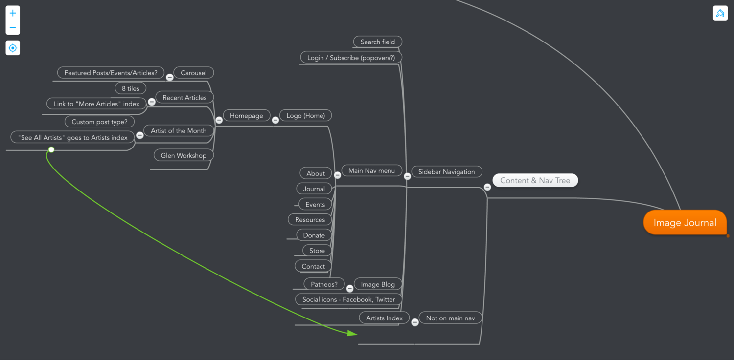
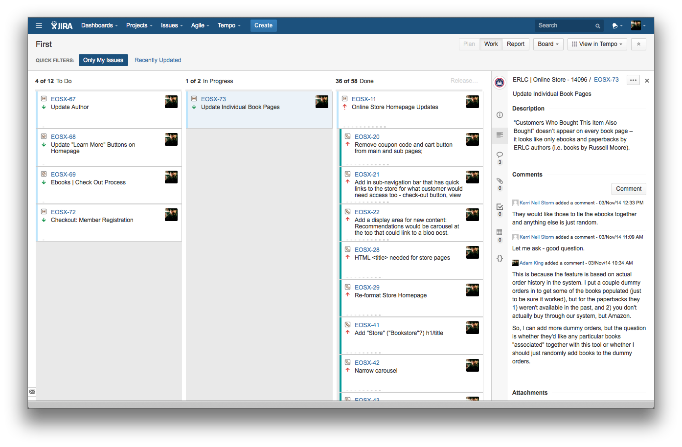
Image Journal site structure map
Mapping the site structure
Sprint planning board
Sprint planning
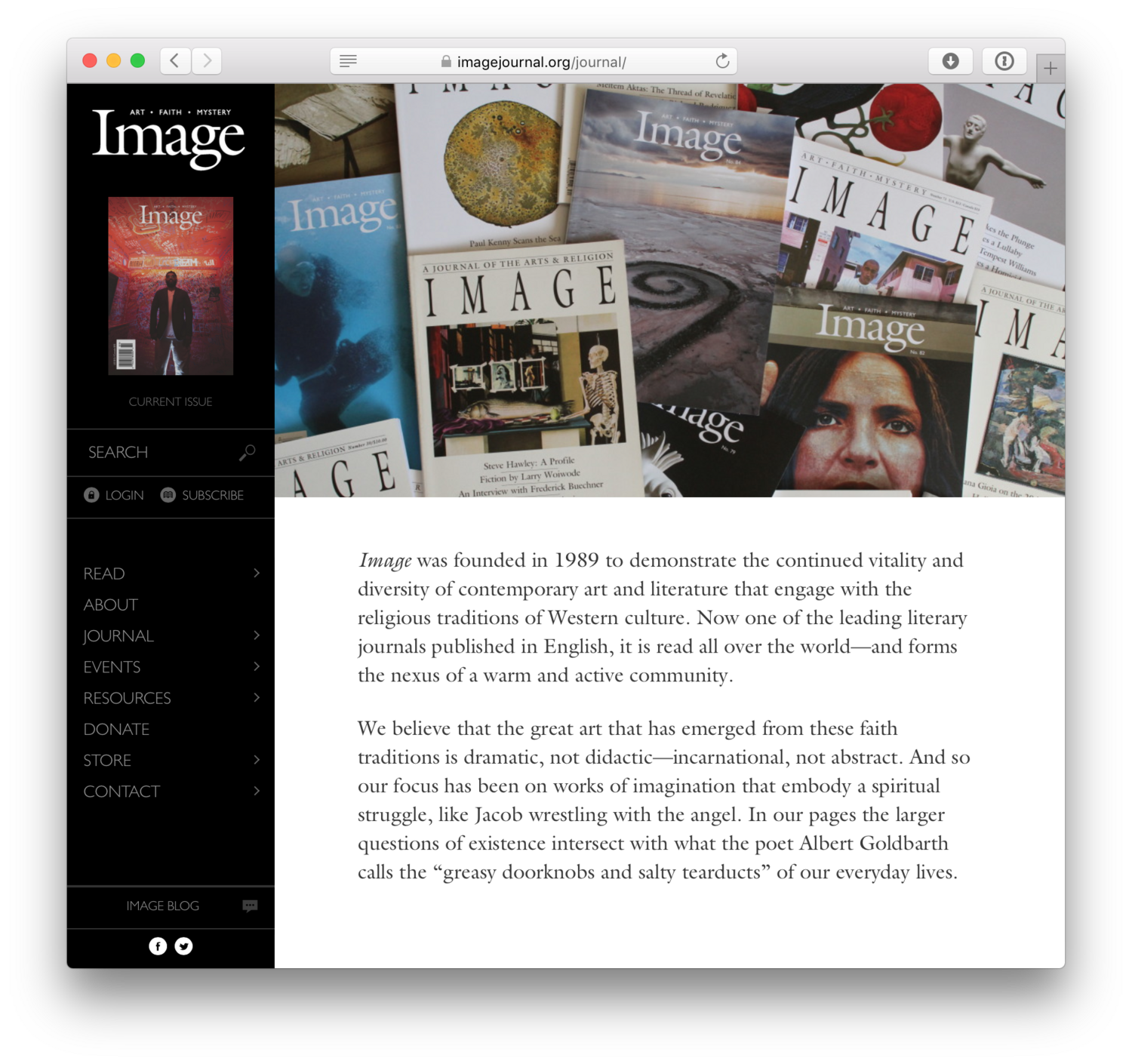
Image Journal homepage built in WordPress
Homepage — built as a WordPress theme
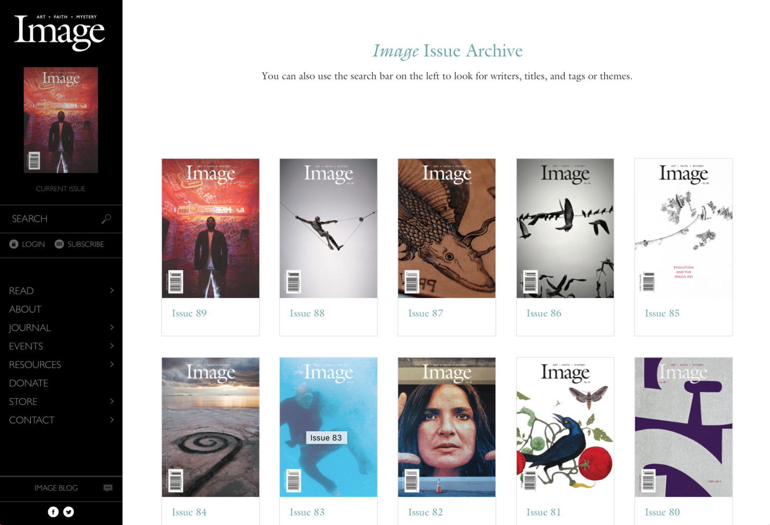
Image Journal issue archive
Issue archive
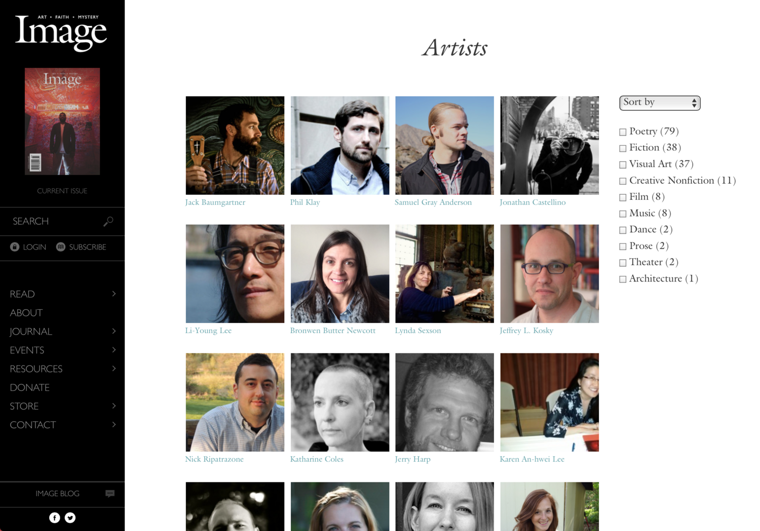
Image Journal artists directory
Artists directory
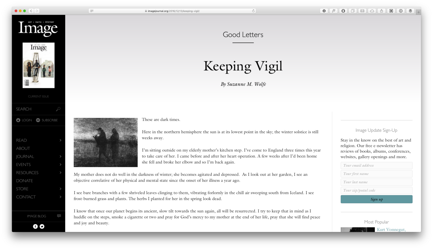
Image Journal article layout
Article layout, from the component library
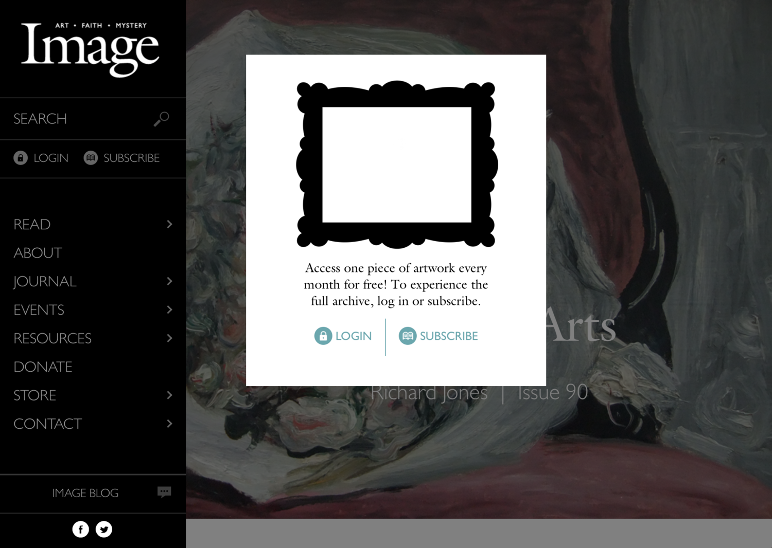
Image Journal custom subscription paywall
Custom subscription / paywall
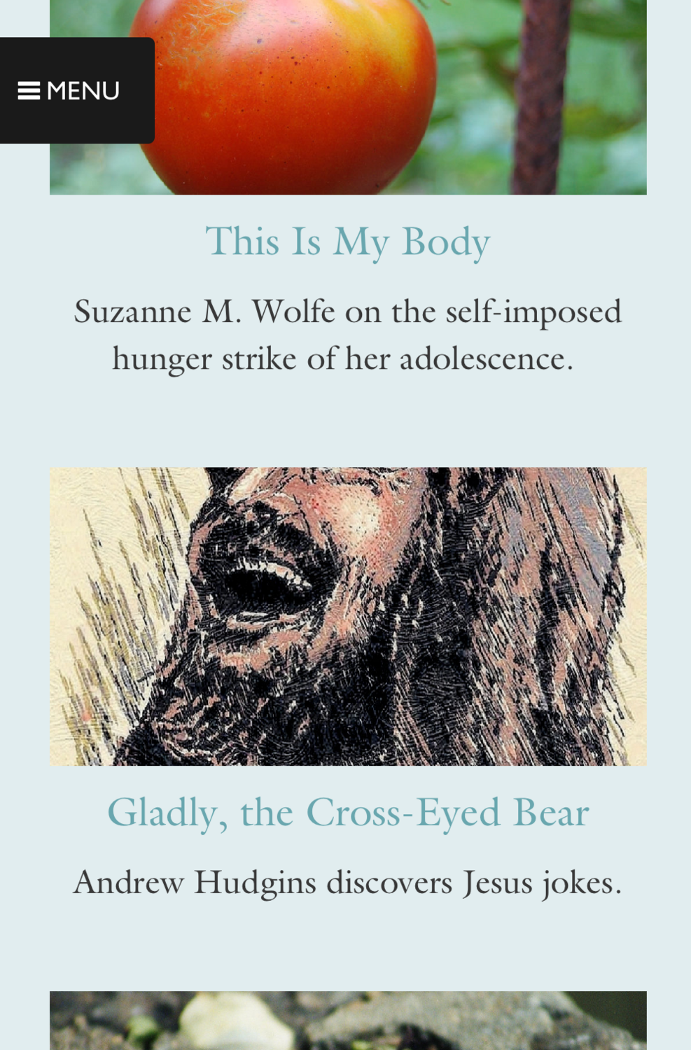
Image Journal responsive mobile layout
Responsive on mobile
Design

IF:Gathering

Overhaul for a multi-million-dollar Shopify store.
UX auditSketchNavigationResponsive UIShopify

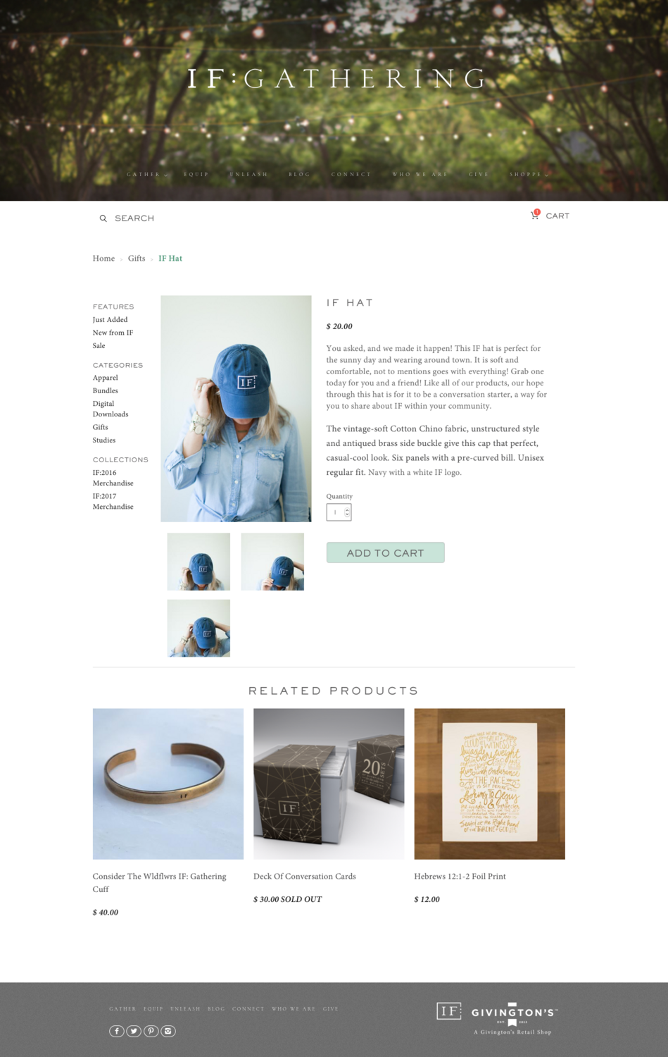
IF:Gathering's store was performing well on sales, but they kept getting complaints from customers who couldn't find the products they were looking for. There was no real navigation; the team wanted to feature products without burying them in a carousel. Search was hard to find and its results pages were ugly, the typography was inconsistent and weak, and odd "select product type" fields showed up on every product page whether or not the product had variations. Mobile — where a large share of sales happened — wasn't great. We set out to fix all of it.
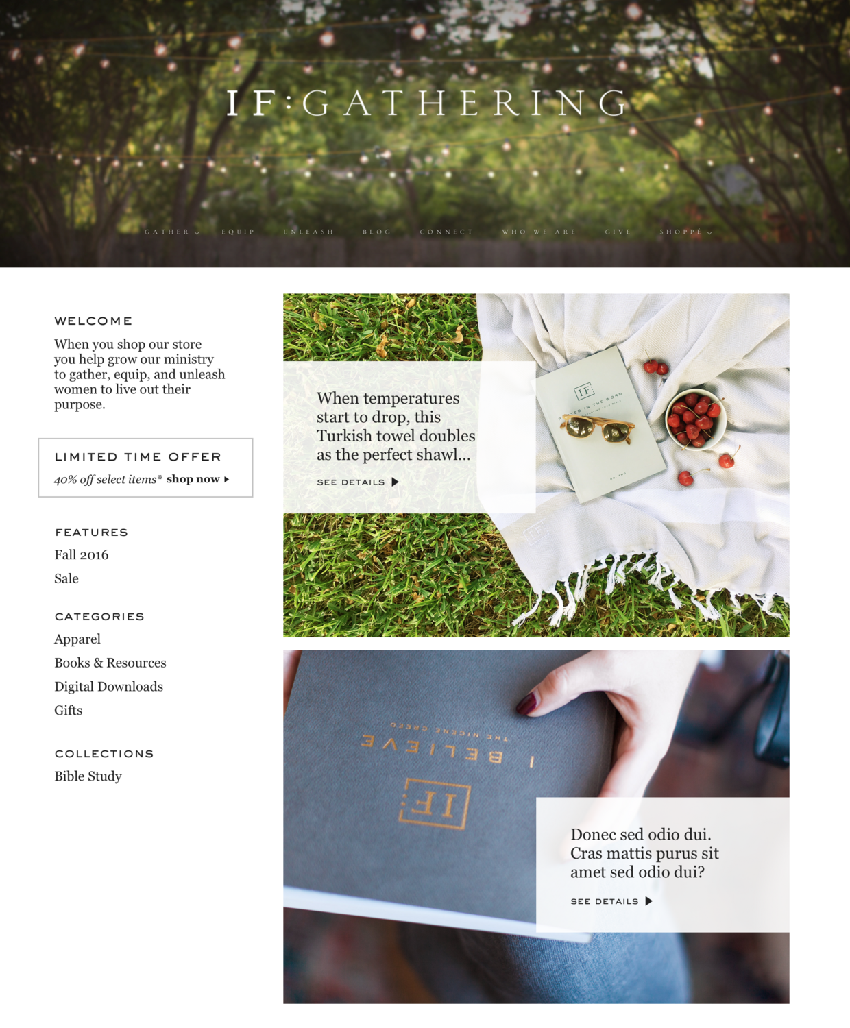
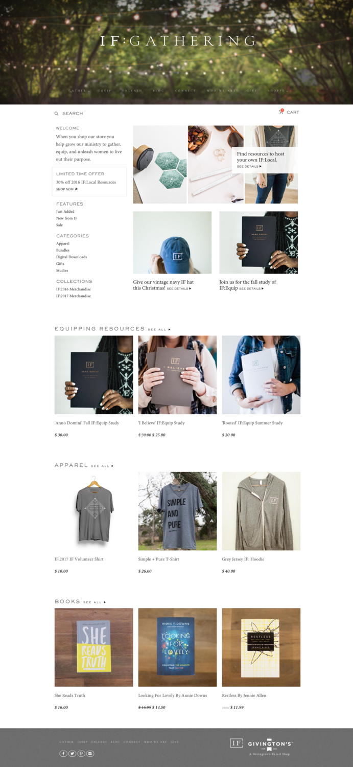
After getting a sense of what they wanted, I moved into Sketch. My constraints were that I couldn't change the header and had to honor the spirit, if not the exact letter, of their brand guidelines. I spent real time exploring typefaces, then mocked up a new sidebar navigation beside two large photo-features. The team preferred one large feature with two smaller ones beneath, so I produced that layout along with collection-teaser rows below it.

The final designs carried through homepage, product, and collection pages across desktop and mobile.

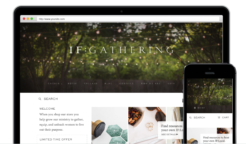
IF:Gathering redesigned store on desktop and mobile
The redesigned store — desktop and mobile
IF:Gathering homepage
Homepage — one large feature over two smaller, with collection rows
IF:Gathering product page
Product page
IF:Gathering collection page
Collection page
IF:Gathering mobile layout
Mobile
UX + UI

Epic.io

An alpha UI in four days.

Wireframes → mockupsProduct UXRapid delivery

Michael Lewkowitz was scheduled to present his new startup at DemoCamp Guelph, but all his team had to demo was a set of roughly sketched wireframes. He hired me with less than a week to spare.

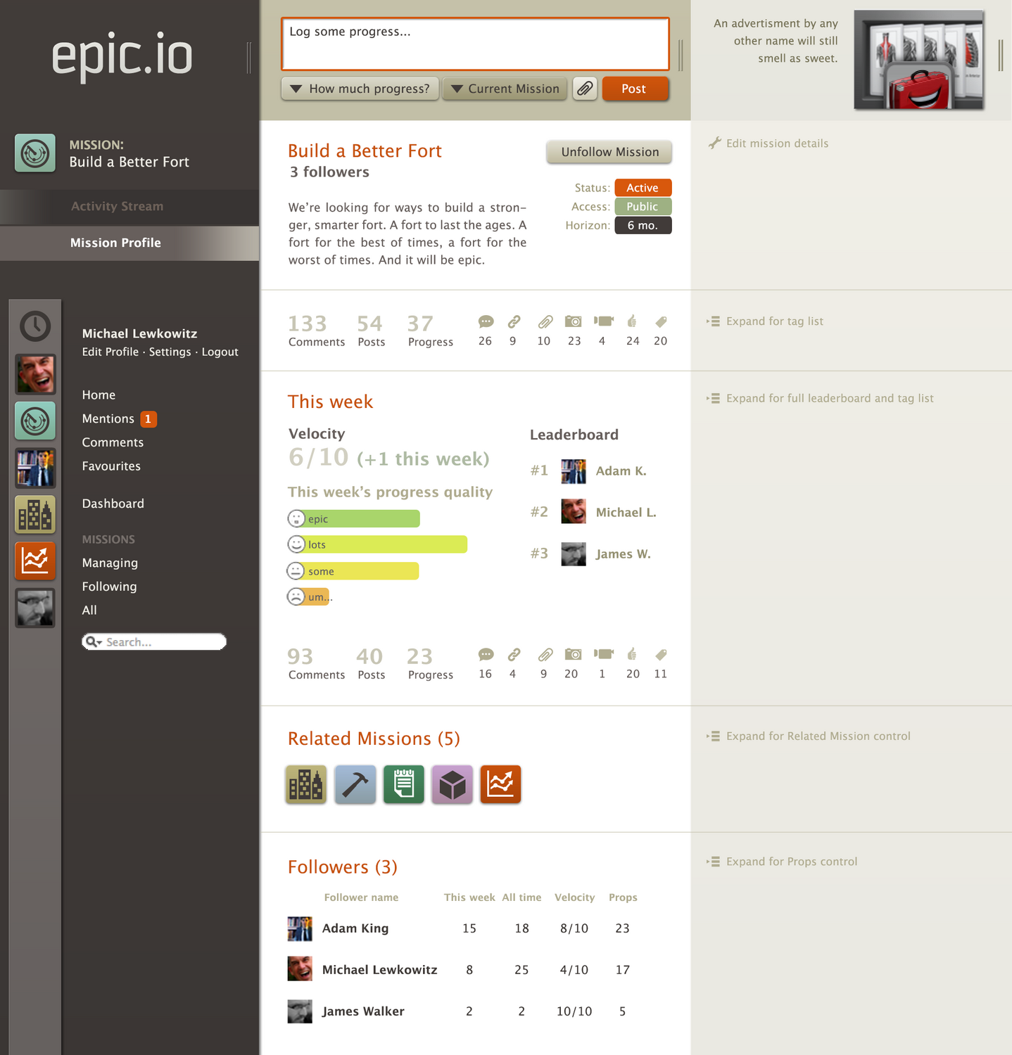
Epic.io aimed to be a hybrid of social network and project-management platform — organically propelling teams forward using "missions" rather than projects, and emphasizing soft metrics around mood, momentum, and collaborative dialogue over traditional project management. I rewired their initial sketches into a set of developed mockups.

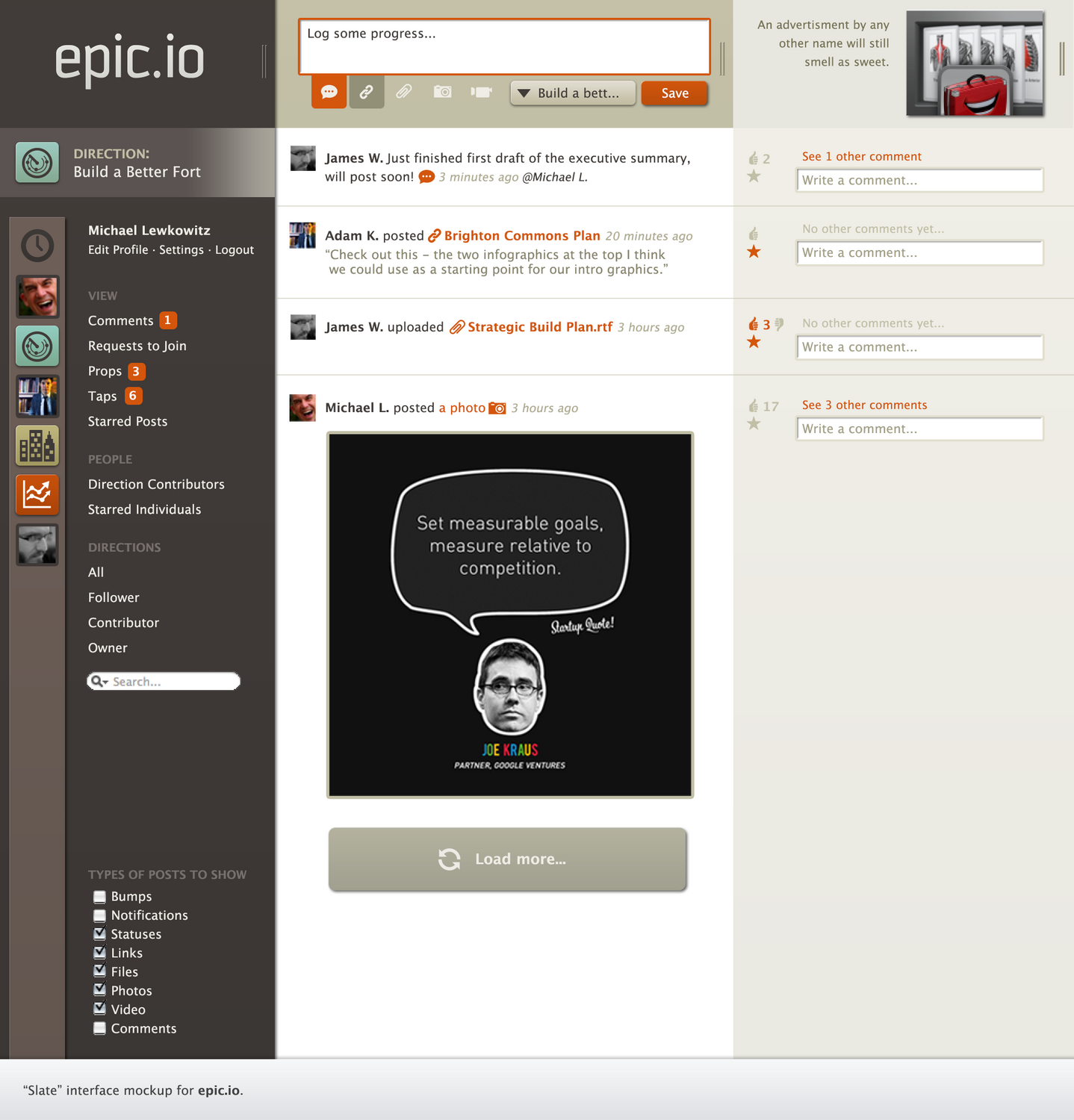
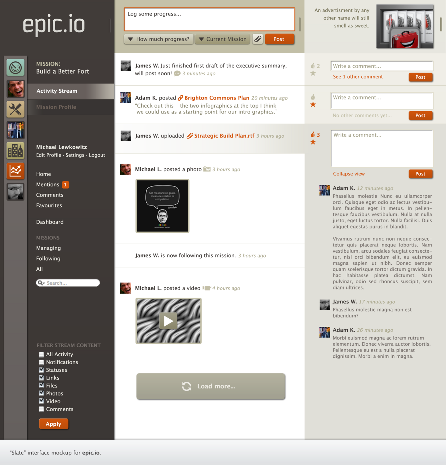
Many interface concepts were deliberately borrowed from consumer apps — activity streams and tagging from Facebook, post-types and "load more" from Tumblr, mentions and open-network "following" from Twitter — alongside project-management predecessors like Basecamp. The goal was to maximize familiarity with social patterns so the app's more unconventional approach to project management wouldn't feel difficult to grasp.

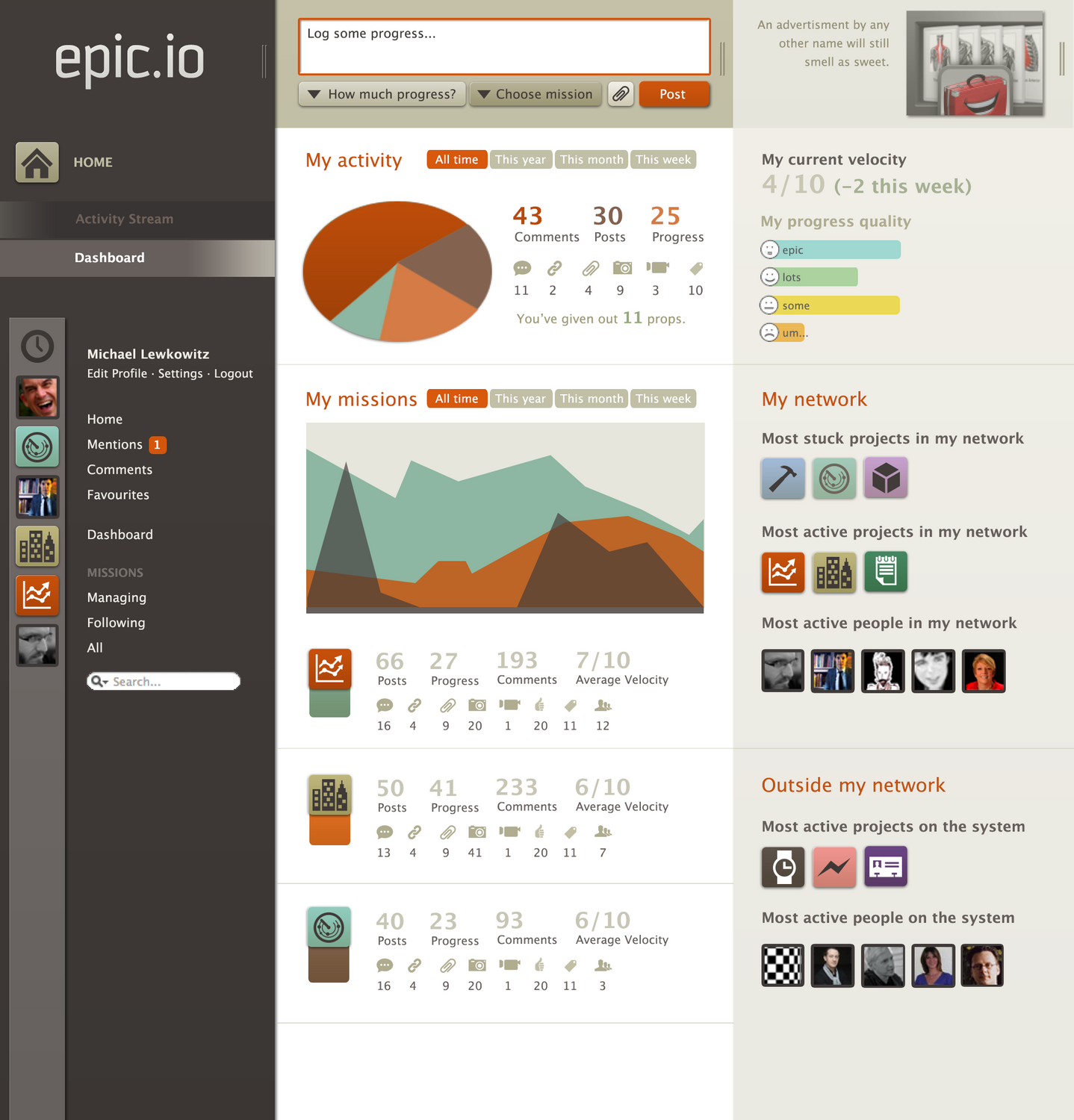
A lot of the UX detail was shaped by the reality of an alpha product. A dock along the universal nav gave quick access to recently used missions and profiles, supporting cross-organization use (this predated Slack). I leaned on manual-refresh devices — a "load more" button instead of infinite scroll, an "apply" button for stream filters, extra clicks to trigger heavier third-column loading — to avoid overwhelming early server capacity. Meanwhile the dashboard made a first pass at the soft-metric visualizations (velocity, progress, activeness) that were core to the product's pitch, using color-coding to tie missions to simple charts.

Epic.io mission activity stream interface
Mission activity stream
Epic.io dashboard with soft-metric charts
Dashboard — soft-metric visualizations
Epic.io mission profile page
Mission profile
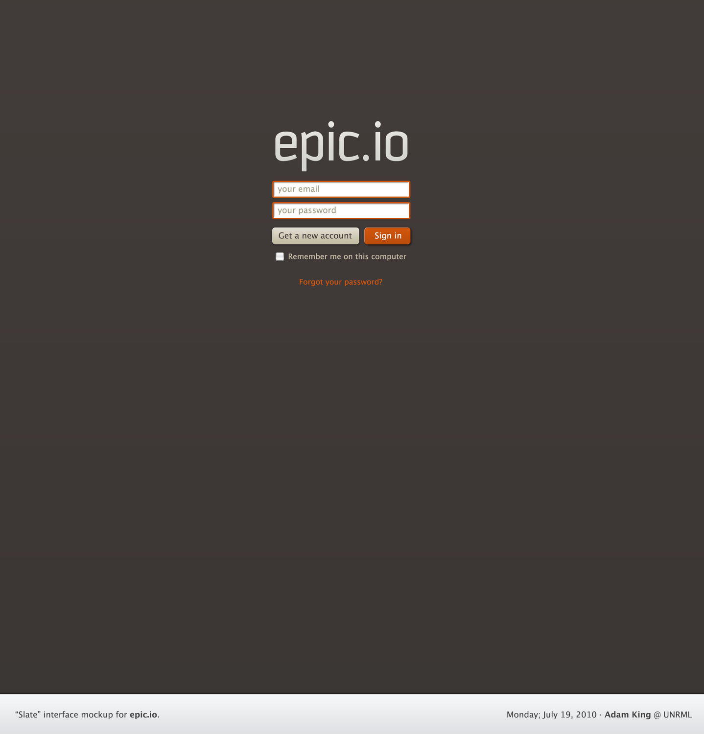
Epic.io login screen
Login
Epic.io expanded activity view
Expanded activity view
Design + Build

Bookstore, Podcasts & Videos

Responsive storefront, directories, and a video system — sketched, then built in the browser.

Responsive designIn-browser buildProduct pagesYouTube API

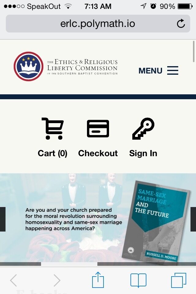
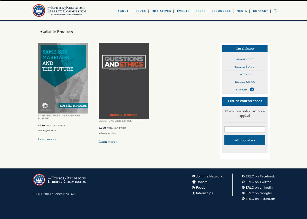
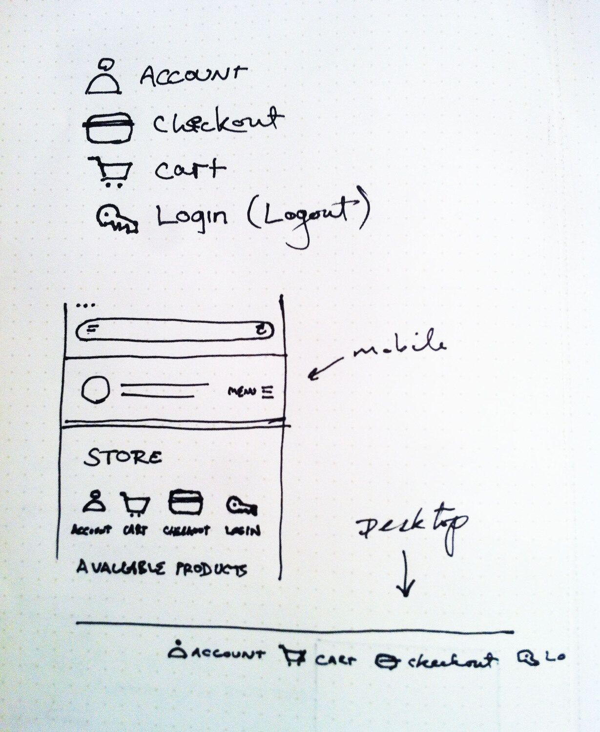
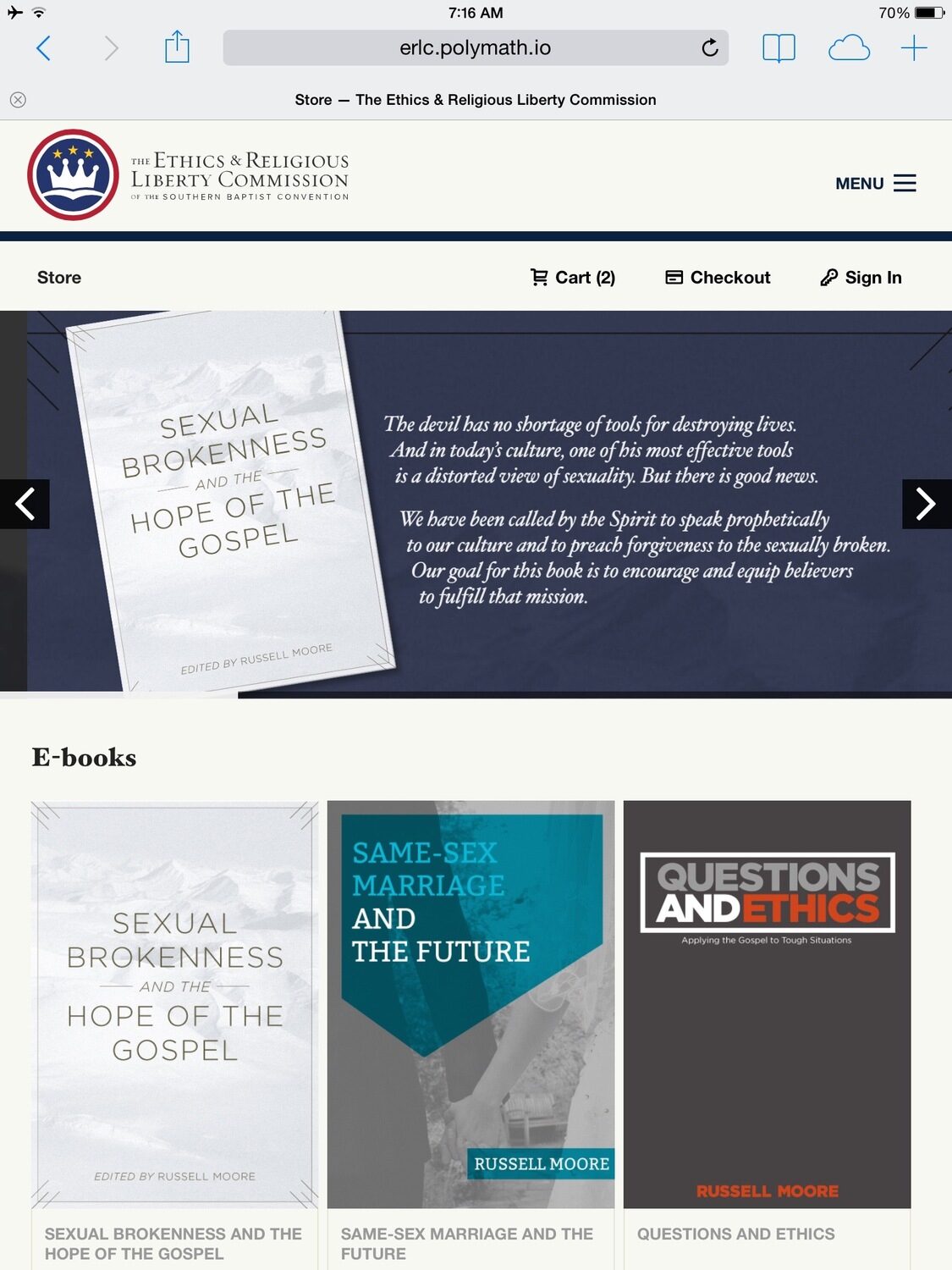
I was first brought in to make the client's online bookstore nicer — they were adding a lot of titles, most redirecting to Amazon while selling ebooks through their own system. Working with a backend developer on a tight deadline, I sketched a new master layout and store navigation, adding a promotional carousel with a feature-callout graphic beside it on wider screens so the carousel didn't dominate. Once the sketches were approved I started building in the browser immediately, and had a working, responsive storefront a couple of days later — tablet and mobile layouts landing close to the original sketches.

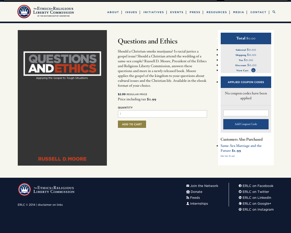
For product pages, I revamped an inherited layout: dropped the stock cart components that appeared on every page, added author info and a share tool, and customized the system for extra options like "Buy on Amazon" and "Free Chapter" links.

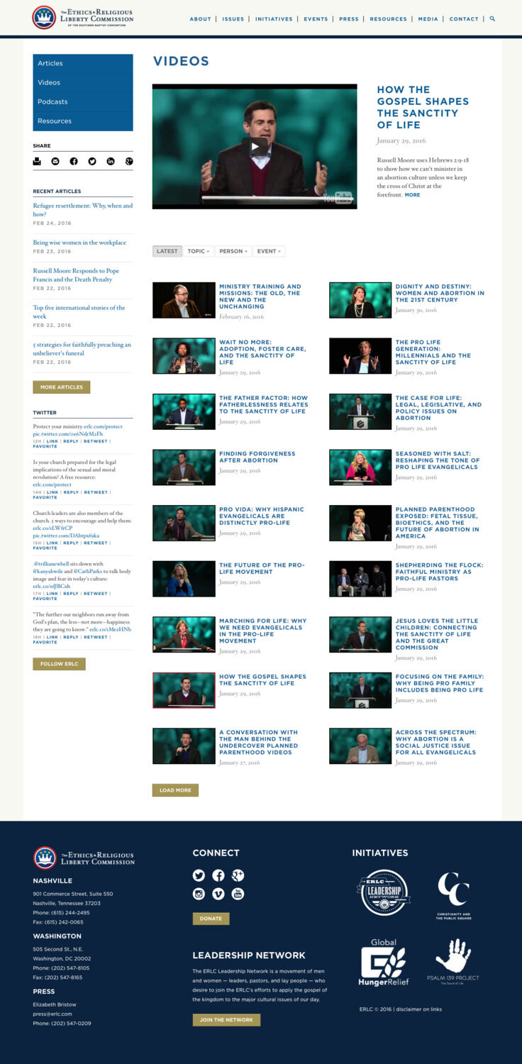
Next came a podcast directory that let visitors explore all three of the client's podcasts on a single page, built closely with a developer. Then a Videos page with a live-loading player and on-page listings and filters — click a listing to load it into the player rather than navigating to separate pages. We wired it to pull videos through YouTube's API and built the filter and listing system, moving toward a simpler, lighter layout.

Hand-drawn storefront wireframe
Sketched the storefront first…
ERLC storefront on mobile
…then built it, responsive on mobile
ERLC bookstore storefront on desktop
Storefront — desktop
ERLC product page
Product page
ERLC storefront on tablet
Responsive on tablet
ERLC video page with live player and filters
Video page — a live player with on-page listings and filters, wired to the YouTube API
Brand + Build

National Youth Arts Week

Kicking off a bilingual national arts week — Semaine nationale jeunesse-arts.

Visual identityBrand systemsBilingualDrupal / custom PHPTeam lead

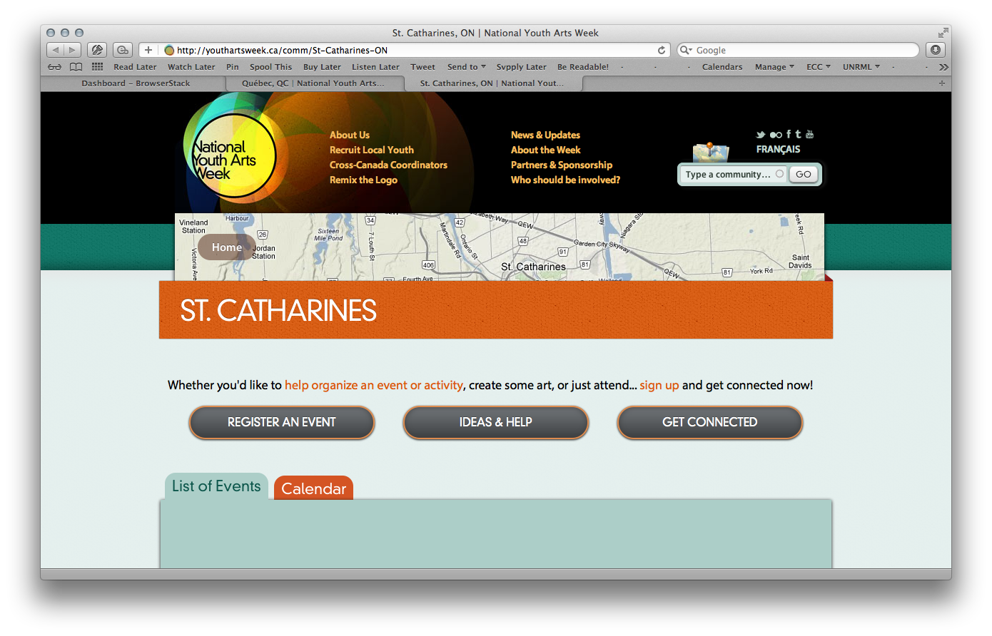
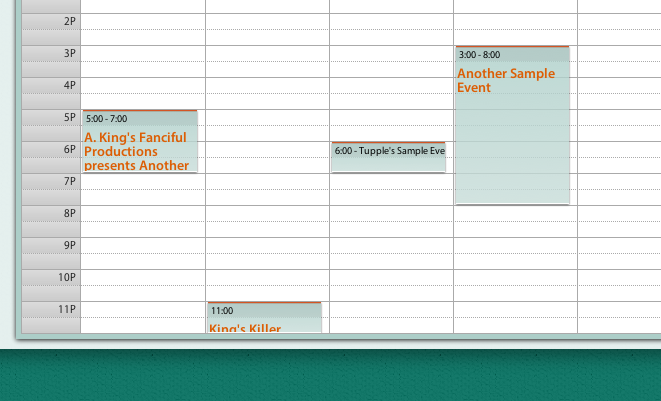
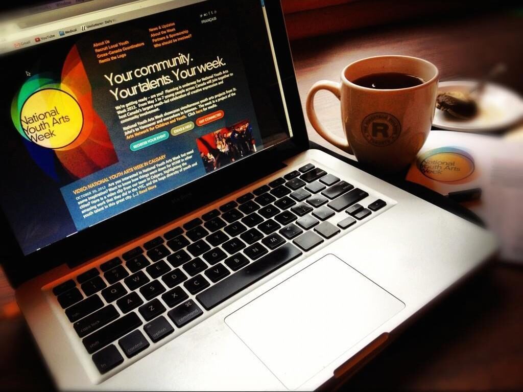
National Youth Arts Week was a massive, bilingual project with only a $10K budget. I created the visual identity and complete brand system, then spearheaded the first two years of web systems — working largely with amateur "youth" developers on a hybrid Drupal / custom PHP build that generated thousands of town-by-town calendars and an event-discovery system across them, to promote a coordinated week of youth arts activities in communities across Canada.

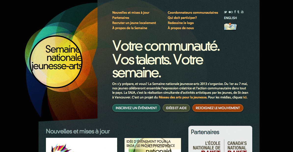
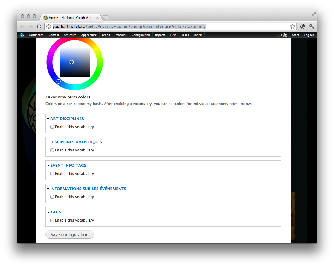
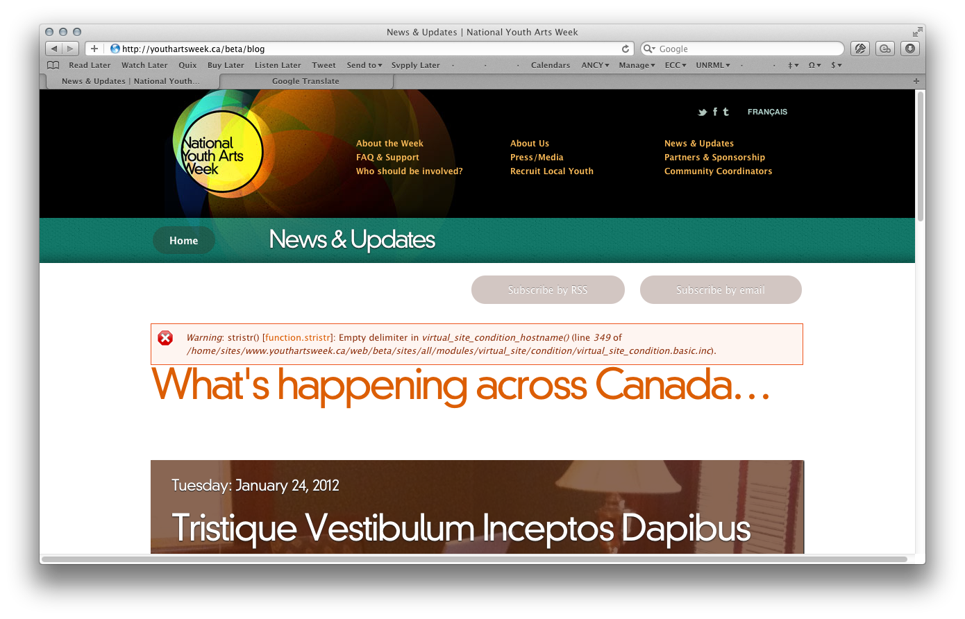
Early on I wrote a planning document, complete with hand-drawn UI sketches, to lay out the intended functionality. Homepage design went through Photoshop mockups (the site leaned heavily on parallax), and after a lot of tweaking, testing, and optimizing, the site ended up bilingual, functional, and — painfully — Internet Explorer compliant.

National Youth Arts Week visual identity
Visual identity
National Youth Arts Week homepage in English
Homepage
National Youth Arts Week homepage in French
…and in French — fully bilingual
Brand toolkit letting communities remix the logo
A brand toolkit that let communities remix the logo with their own art
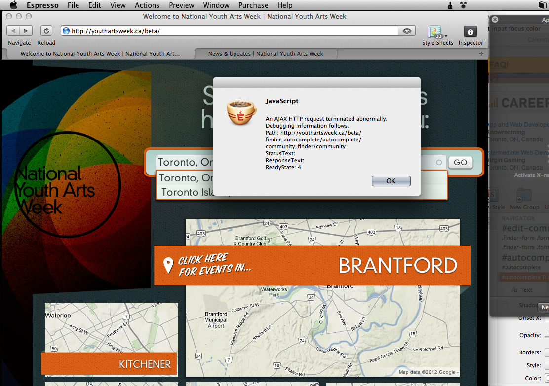
Event discovery map across Canada
Event discovery across Canada
A town-by-town community page
Community event calendar
National Youth Arts Week print collateral
Print collateral
IA + Design

Transit City

Designing for Metrolinx & the TTC.

Information architecturePersonasWireframingVisual designDrupal-ready

Assets from this project are proprietary and confidential, held in copyright by Wise & Hammer (Peapod Studios) or the Toronto Transit Commission, and shown for professional portfolio purposes only.

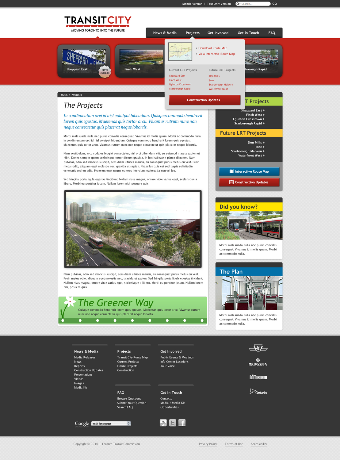
The Toronto Transit Commission wanted a website to tell the public about the upcoming "Transit City" light-rail system. The project never launched — Transit City itself was cancelled — but I got to work with a great team at Peapod Studios on information architecture, visual style, and full site mockups.

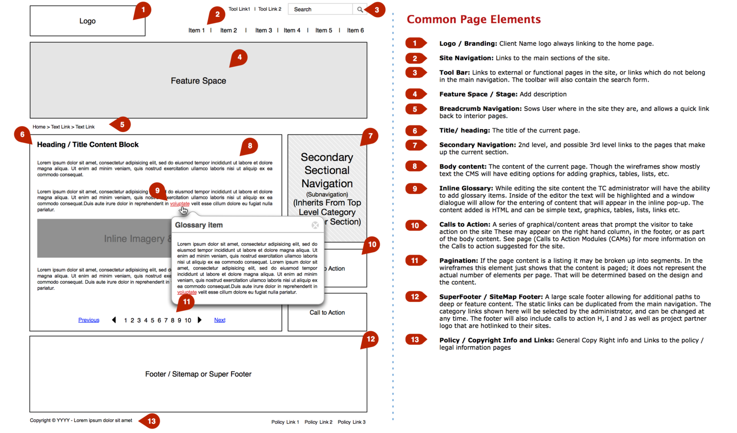
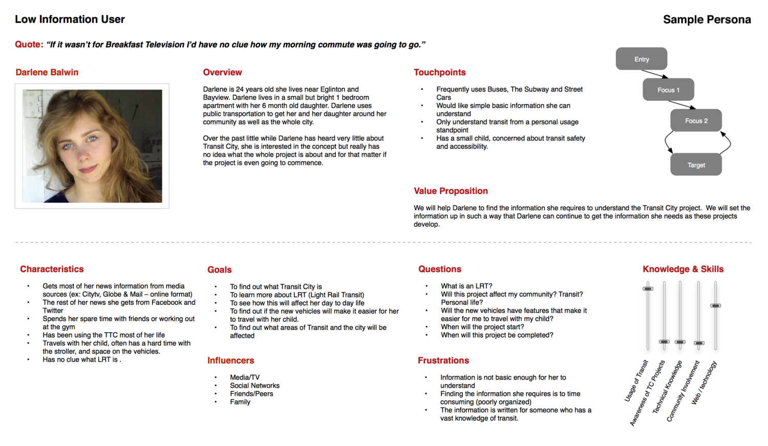
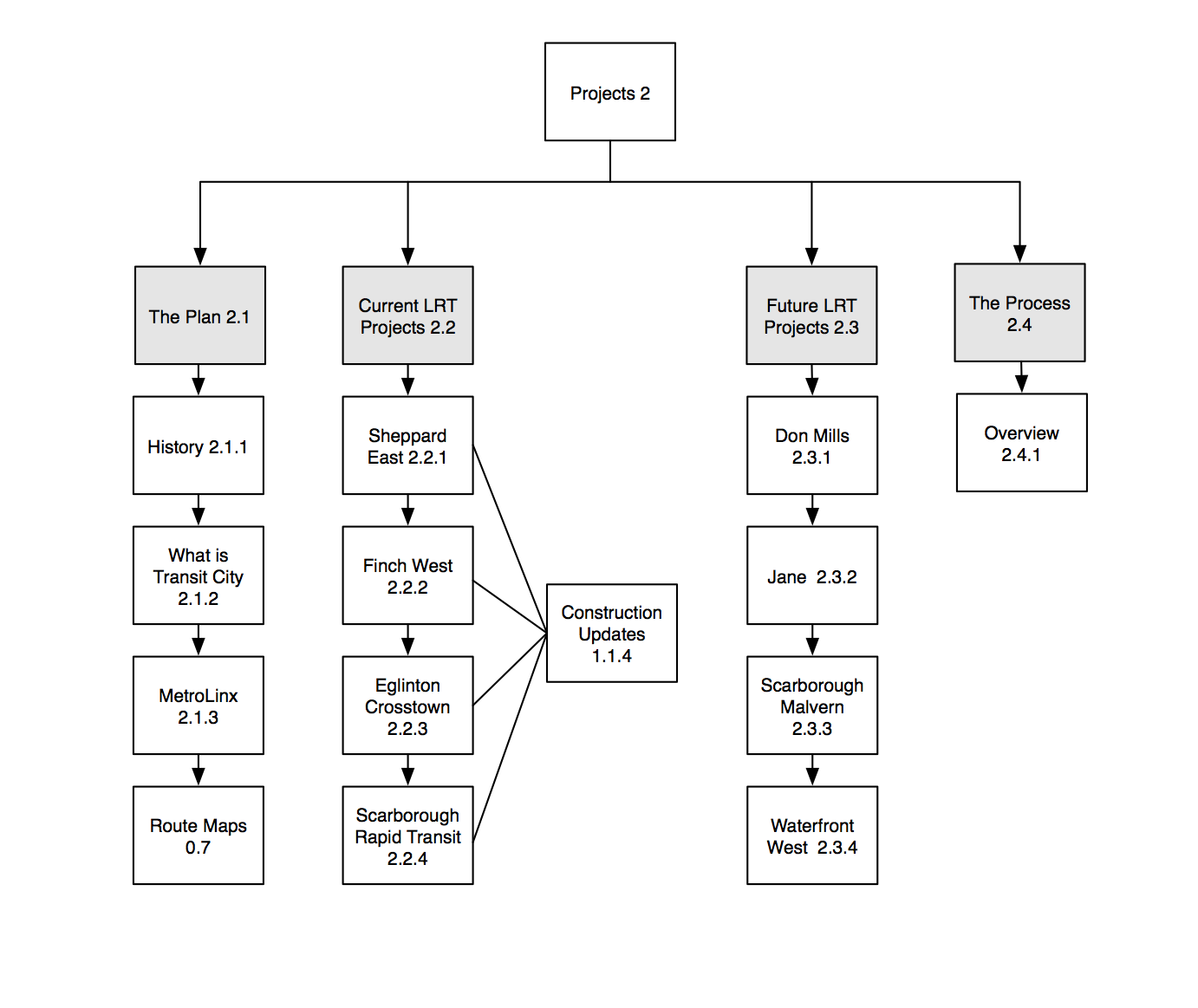
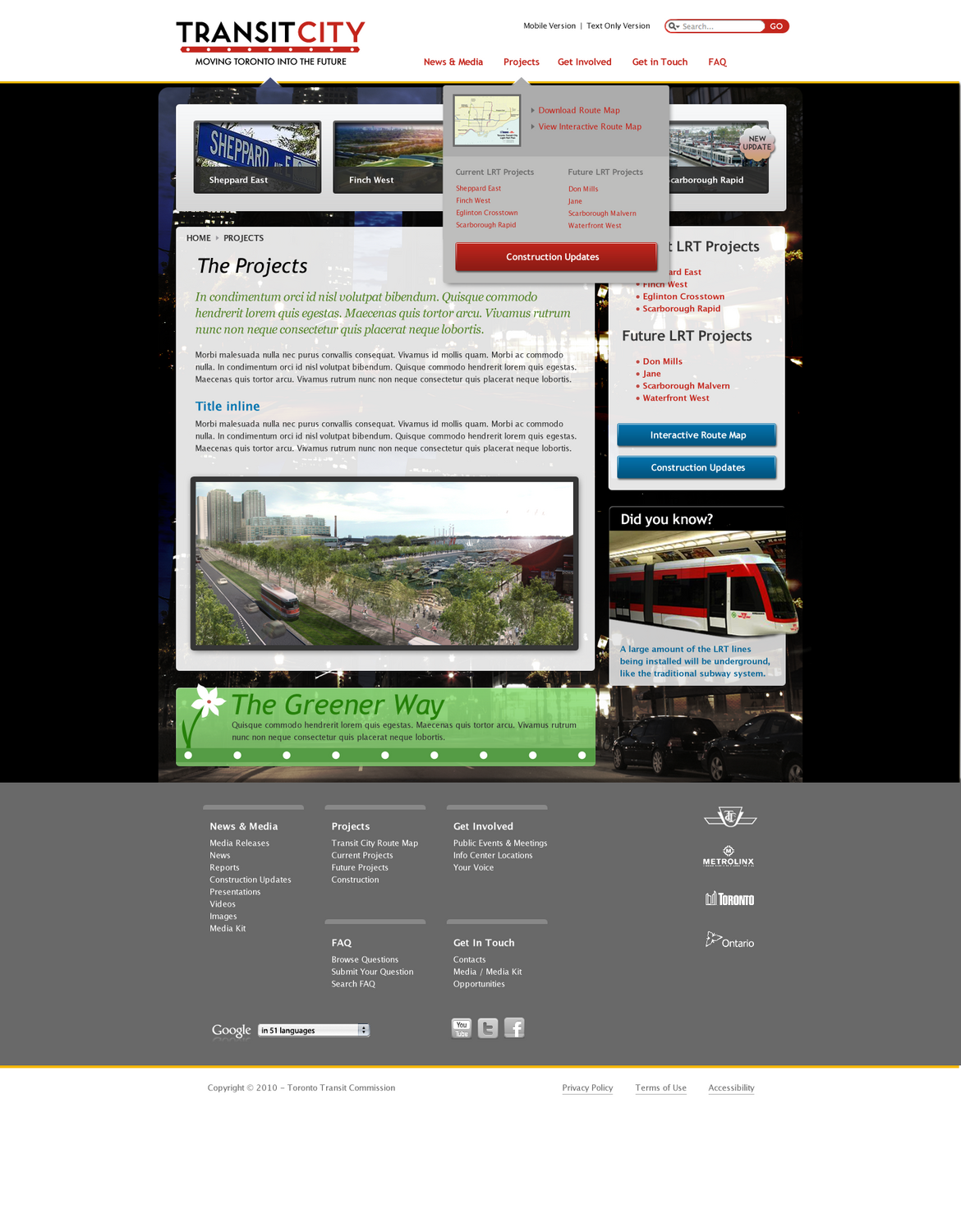
Before mockups, we ran a conventional user-centered discovery process: full wireframing in OmniGraffle, content and navigation trees, and user-persona development. I designed the mockups with Drupal in mind for build, structuring them so developers could cleanly use both a 960 grid system for the HTML/CSS and a Drupal Views / module-oriented approach for the CMS — less work on the development end. As part of our process we gave the client multiple thematic directions, so I produced a full second set of mockups presenting an alternative visual approach.

Transit City annotated page-element wireframe
Annotated common-page-elements spec
Transit City user persona
User persona
Transit City site architecture tree
Site architecture
Transit City homepage mockup
Homepage mockup
Transit City alternative visual design option
A second visual-design option, presented alongside the first
Design

Ethical Coffee Chain

Making the supply chain personal.

Subscription onboardingCTA designConversionCo-founder

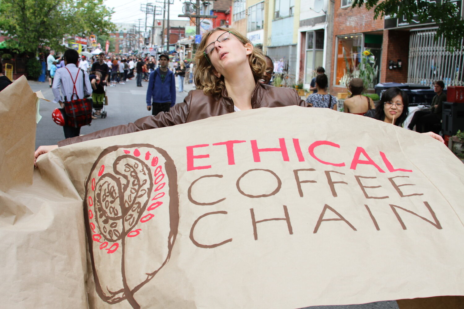
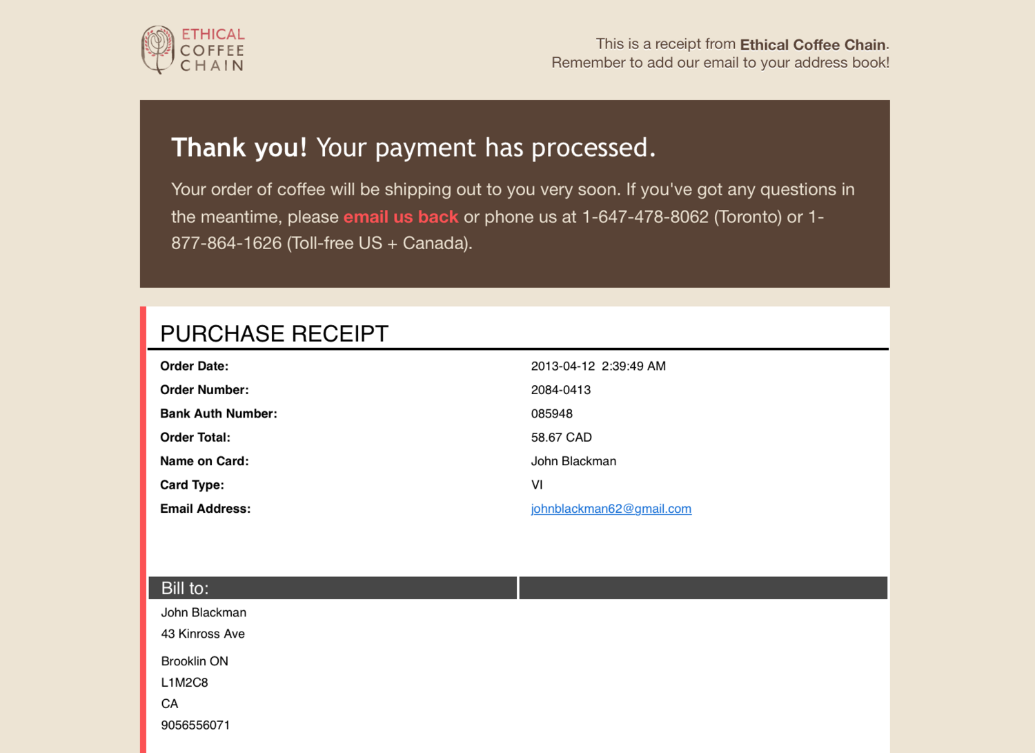
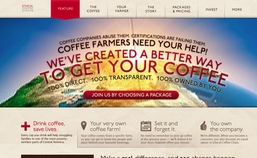
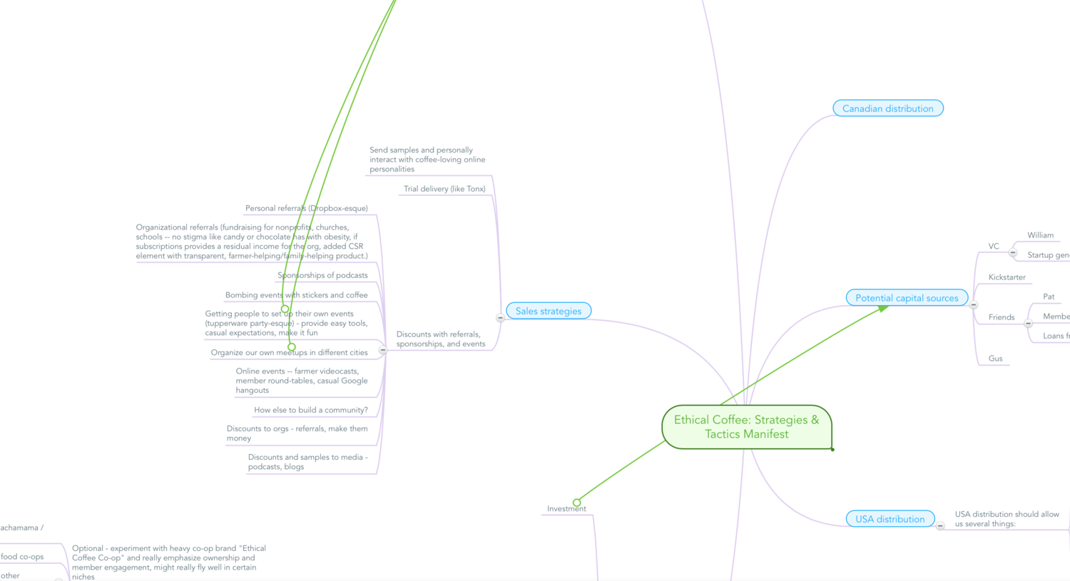
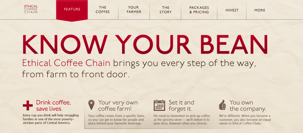
A social-enterprise coffee subscription I co-founded and ran, matching struggling coffee farmers with drinkers who wanted their purchase to make a difference. On the design side, I iterated the homepage call-to-action, designed the subscription onboarding flow, and handled the ongoing loop of planning, marketing, testing, and iterating on the storefront.

Ethical Coffee Chain homepage
Homepage — coffee on a mission, farm to front door
Ethical Coffee Chain subscription plans
Subscription plans, framed by the kind of drinker you are
Ethical Coffee Chain subscription checkout
Subscription checkout
Ethical Coffee Chain product page
Product page
Ethical Coffee Chain brand identity on a coffee bag
Brand identity
Odds & Ends

Catch Basin

Samplings from various projects.

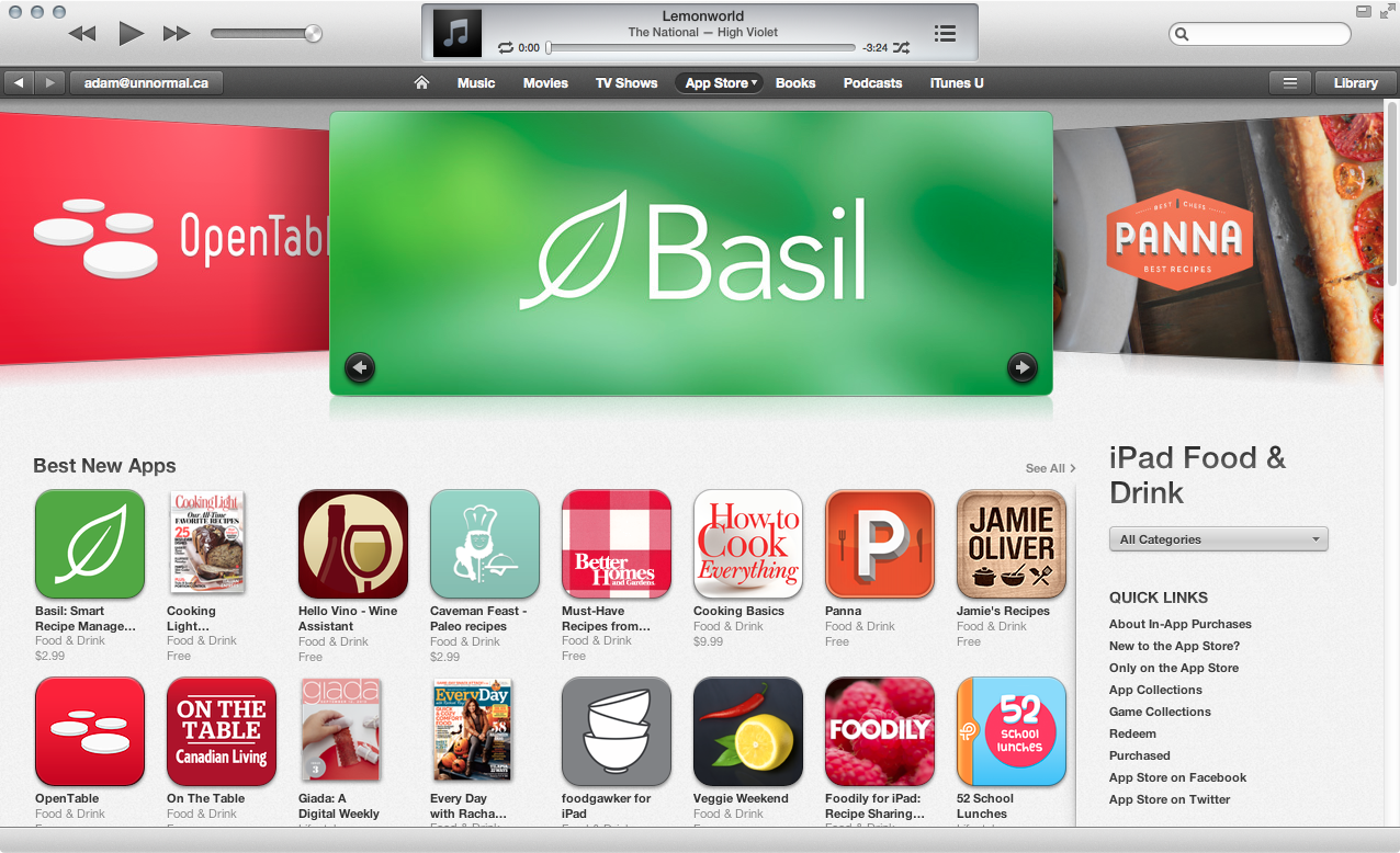
A grab-bag of smaller pieces: App Store feature graphics for Basil, an iPad recipe app, and community-portal wireframes for the Grand Erie Business Centre.

Basil app feature graphic
Basil — feature graphic
Basil featured in the iPad App Store
Basil, featured in the iPad App Store